You Can’t Greenwash a Dashboard: Visualisation That Actually Matters
Written by: Priyanka Nair
There’s something reassuring about a good dashboard.
Clean visuals.
Green indicators.
Upward trends.
It looks like progress but here’s the uncomfortable question: What if the story your dashboard is telling… isn’t entirely true?
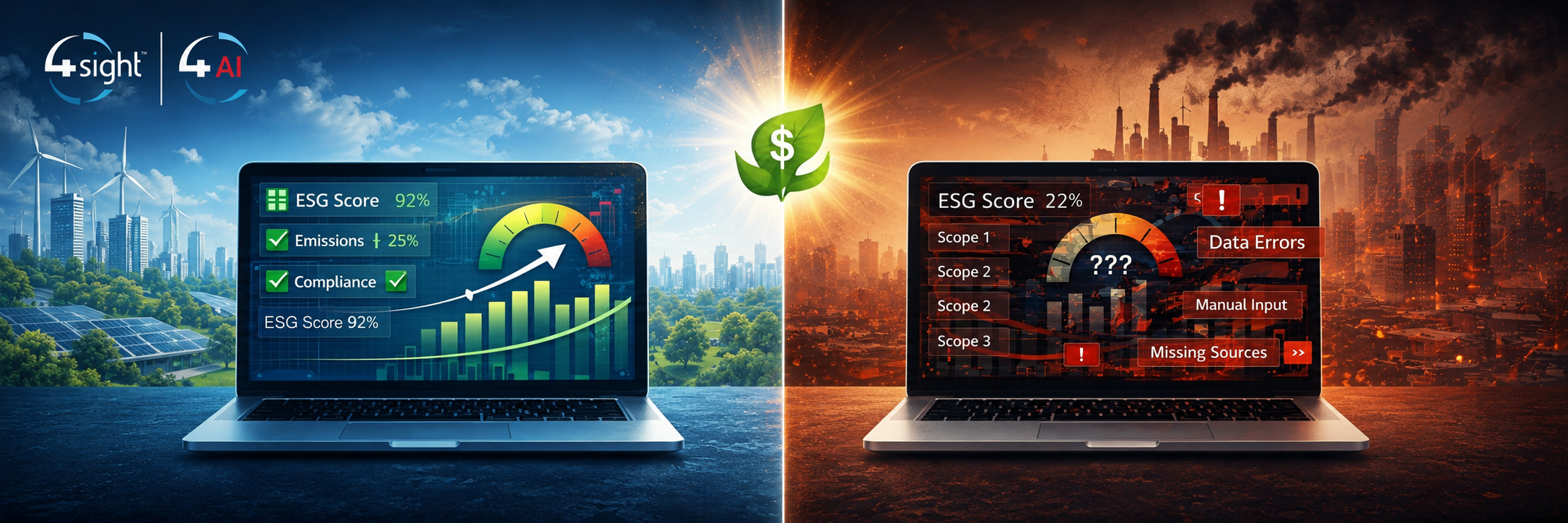
The Illusion of Insight
Over the past few years, ESG dashboards have become the go-to tool for executives, boards, and sustainability teams. Real-time visuals, automated KPIs, and interactive reports promise clarity in a space that’s often complex. And to be fair dashboards are powerful but only when the data behind them is.
Because here’s the reality: A dashboard doesn’t validate your data. It visualises it.
If the underlying data is incomplete, inconsistent, or poorly governed…all you’ve done is make the problem easier to look at.
When “Green” Doesn’t Mean Good
Let’s take a simple example. A company reports a steady reduction in emissions on its dashboard. The trend looks great. Leadership is confident. The narrative is strong.
But dig one layer deeper:
Scope 3 emissions are missing or estimated
Supplier data hasn’t been updated in months
Different business units are using different calculation methods
Suddenly, that clean downward trend becomes… questionable.
This isn’t hypothetical. Across industries, data quality and consistency remain one of the biggest barriers to reliable ESG reporting, with many organisations still relying on fragmented systems and manual processes, and that’s where the risk lies.
Because dashboards don’t just inform decisions, they shape perception, strategy, and trust.
Visualisation Does Not Equal Validation
There’s a growing misconception that better visualisation leads to better ESG outcomes.
But visualisation is the last step in the chain, not the first. Before a metric reaches a dashboard, it should have already gone through:
Data collection across multiple systems
Standardisation and alignment
Validation and quality checks
Governance and auditability
Skip these steps, and you’re not visualising insight. You’re visualising assumptions.
What Actually Makes a Dashboard “Good”
A meaningful ESG dashboard isn’t defined by how it looks, it’s defined by what it’s built on.
That means:
Trusted data pipelines: Connected systems that reduce manual input and inconsistency
Strong data governance: Clear definitions, ownership, and validation processes
Consistency across the organisation: One version of the truth, not five interpretations
Traceability and auditability: The ability to explain where every number comes from
Because at the end of the day, the goal isn’t just to see ESG performance. It’s to trust it, act on it, and stand behind it.
Why This Matters More Now
ESG is under more scrutiny than ever. Investors are asking harder questions. Regulators are tightening requirements. Stakeholders expect transparency, not just storytelling.
In this environment, dashboards either build credibility or quietly expose gaps- there’s very little middle ground.
You can’t greenwash a dashboard. Because eventually, the data, or lack of it, catches up.
At 4Sight, we see dashboards as the final layer, not the entire solution.
The real work happens underneath: building connected data ecosystems, automating flows, and ensuring ESG data is accurate, governed, and decision ready. Because when the data is right, the dashboard just doesn’t look good; it actually means something.
Not sure where your ESG data foundation actually stands? That's exactly where we start. Reach out to the 4Sight team at data@4sight.cloud.